
웹 개발에서는 다양한 기기에 대응하는 화면을 제공하는 것 또한 중요하다. React에서 사용자의 기기 정보를 탐지하여 적절한 UI를 제공할 수 있는 라이브러리인 react-device-detect에 대해 다루어 보았다.
react-device-detect란?
몇몇 사이트들은 모바일 접속을 한 경우 특정 창을 띄우거나, 모바일 버전이 개발되지 않았다면 제한을 거는 경우가 있다.


이러한 처리는 물론 반응형 디자인을 통해 적용할 수 있다. 하지만 반응형 디자인은 화면 크기, 해상도에 비례하여 작용하고, 디바이스를 구분하는 것은 아니다. (물론 조금 다른 방식으로 가능은 하다.)
react-device-detect는 사용자의 기기와 브라우저 정보를 확인하고, 이에 맞는 컴포넌트를 렌더링할 수 있게 해주는 라이브러리이다. 이 라이브러리는 모바일, 태블릿, 데스크탑 뿐만 아니라 특정 브라우저와 버전까지 탐지할 수 있다. 예를 들어, 특정 브라우저(Chrome, Safari 등)나 특정 운영체제(Android, iOS 등)를 대상으로 한 맞춤형 UI를 제공하는 데 유용하다.
- 기기 탐지: 모바일, 태블릿, 데스크탑 등 다양한 기기를 구분할 수 있다.
- 브라우저 탐지: Chrome, Safari, FireFox 등 특정 브라우저를 감지할 수 있다.
- 운영체제 및 버전 탐지: Windows, MacOS, iOS, Android 등 다양한 운영체제 및 그 버전을 탐지할 수 있다.
react-device-detect를 설치하고 샘플 코드를 작성해 보았다.
$ npm install react-device-detectimport {
BrowserView,
MobileView,
isBrowser,
isMobile,
} from "react-device-detect"
function App() {
return (
<div style={{ margin: "30px" }}>
<BrowserView>
<h1>Browser View</h1>
</BrowserView>
<MobileView>
<h1>Mobile View</h1>
</MobileView>
{isBrowser && <h3>isBrowser</h3>}
{isMobile && <h3>isMobile</h3>}
</div>
)
}
export default App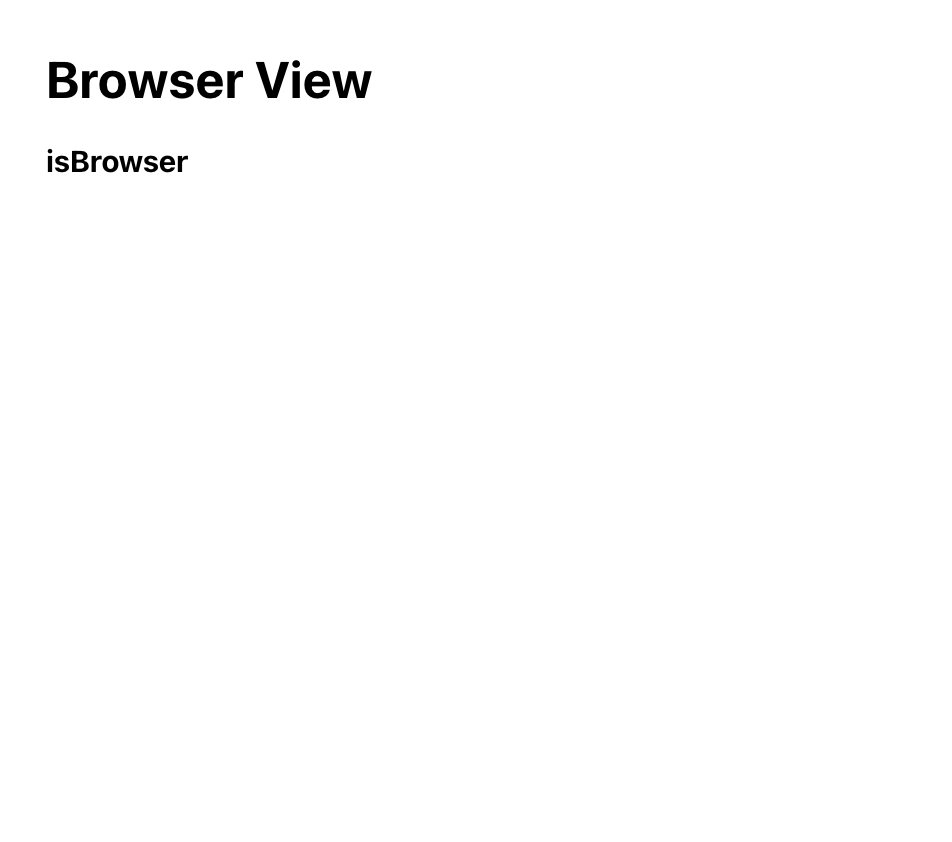
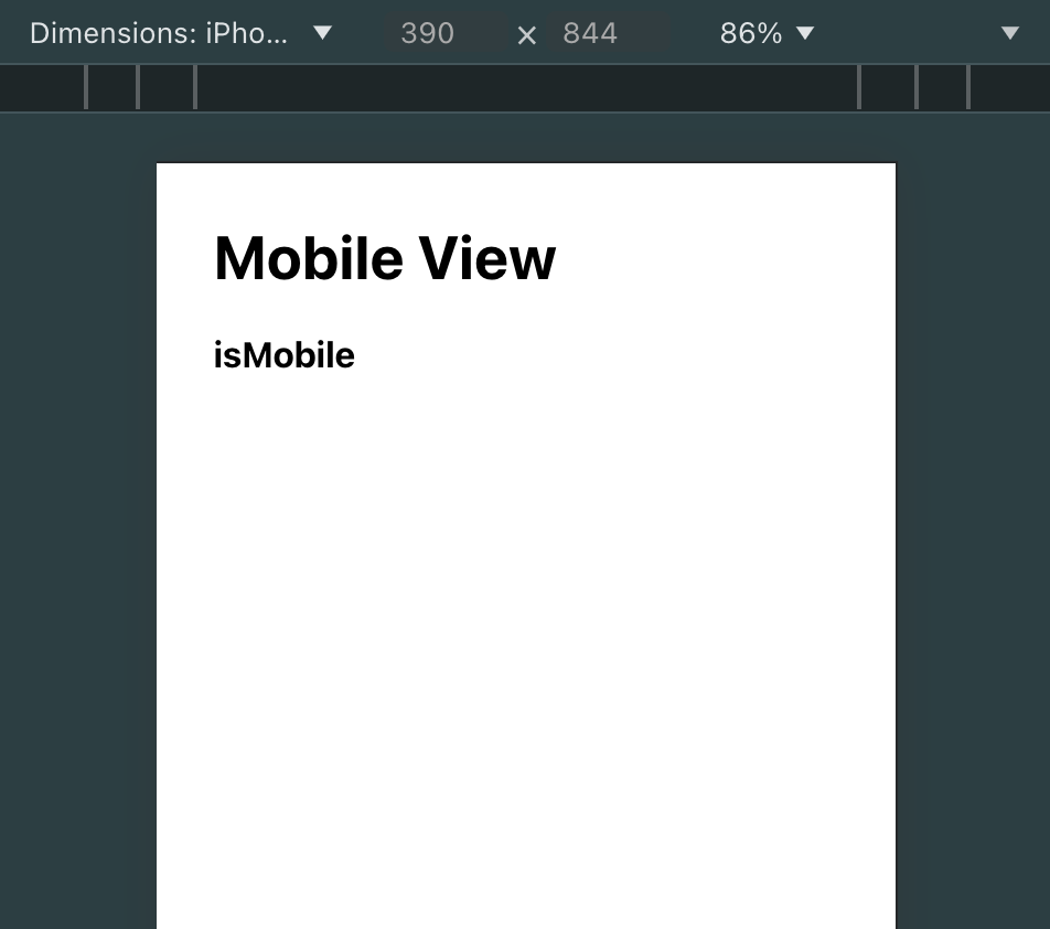
모바일 화면은 Chrome의 반응형 디자인 모드에서 확인하였다. 위 예제에서는 BrowserView와 MobileView 컴포넌트를 사용하여 브라우저와 모바일에서 각각 다른 내용을 보여준다. 또한, isBrowser와 isMobile을 사용하여 조건부 렌더링을 구현할 수 있다.
브라우저 구분
특정 브라우저나 기기에 대한 조건부 렌더링이 필요할 때는 CustomView와 condition을 사용하면 된다. 예를 들어, 특정 브라우저에서만 메시지를 보여주고 싶을 때 아래와 같이 구현할 수 있다.
import { CustomView, browserName } from "react-device-detect"
function App() {
return (
<div style={{ margin: "30px" }}>
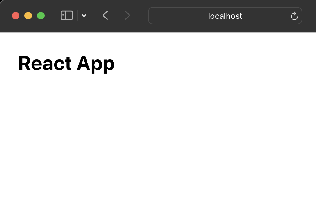
<h1>React App</h1>
<CustomView condition={browserName === "Chrome"}>
<h1>This is Chrome Browser.</h1>
</CustomView>
</div>
)
}
export default App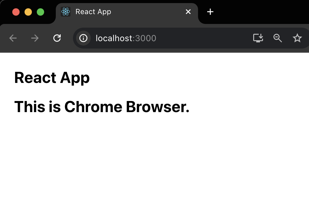
활용 예제
예제로 모바일 기기에서 접속 시 "PC에서 접속해주세요"라는 메시지를 보여주는 페이지를 구현해 보았다.
import { isMobile } from "react-device-detect"

function MobilePage() {
  return (
    <div style={{ textAlgin: "center", padding: "20px" }}>
      <h1>PC에서 접속해주세요</h1>
      <p>모바일에서 접근할 수 없는 페이지입니다.</p>
    </div>
  )
}

function App() {
  return (
    <div style={{ margin: "30px" }}>
      {isMobile ? (
        <MobilePage />
      ) : (
        <div>
          <h1>React</h1>
          <h3>사용자 인터페이스를 만들기 위한 JavaScript 라이브러리</h3>
          <p>
            React (also known as React.js or ReactJS) is a free and open-source
            front-end JavaScript library for building user interfaces based on
            components by Facebook Inc. It is maintained by Meta (formerly
            Facebook) and a community of individual developers and companies.
            React can be used to develop single-page, mobile, or server-rendered
            applications with frameworks like Next.js. Because React is only
            concerned with the user interface and rendering components to the
            DOM, React applications often rely on libraries for routing and
            other client-side functionality. A key advantage of React is that it
            only rerenders those parts of the page that have changed, avoiding
            unnecessary rerendering of unchanged DOM elements. It was first
            launched on 29 May 2013.
          </p>
        </div>
      )}
    </div>
  )
}

export default App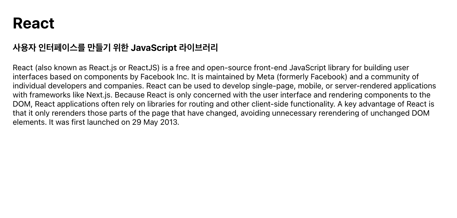
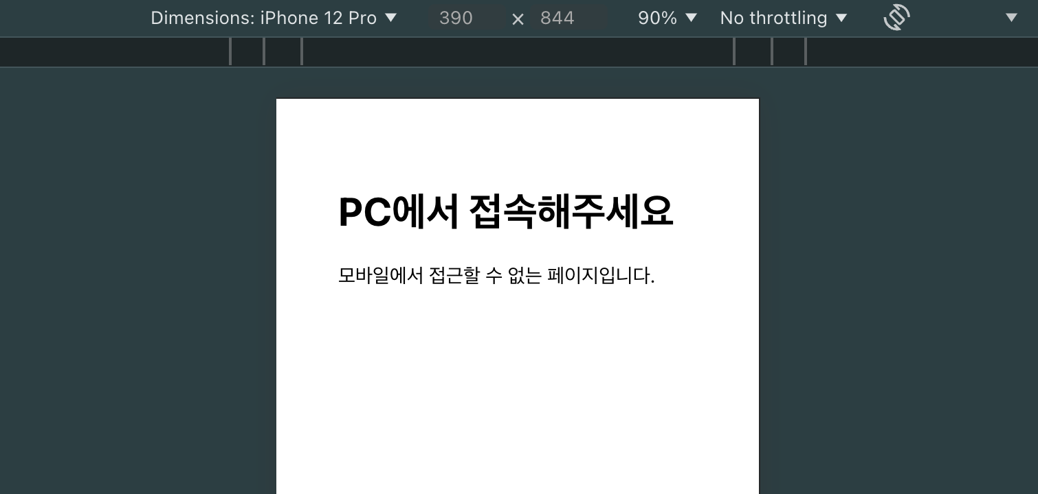
위 예제에서는 isMobile 값을 사용하여 모바일 기기인지 여부를 확인하고, 모바일일 경우 MobilePage 컴포넌트를 렌더링한다. 이런 식으로 모바일 사용자가 PC로 사이트를 이용할 수 있도록 안내할 수 있다.
react-device-detect는 다양한 기기 및 브라우저 감지를 통해 사용자에게 최적화된 경험을 제공하는 데 유용한 도구이다. 보통의 반응형 웹 디자인의 경우 CSS 미디어 쿼리나 UI 라이브러리에 내장된 디바이스 구분 기능을 사용하는 것이 더 적합할 수 있겠지만, 어떤 상황에서는 이 라이브러리를 사용하는 것도 좋은 방법인 것 같다.
Reference
React (JavaScript library) - Wikipedia
